Our Kitchen Cabinet Makeover
This has been a long and continuous process of transforming our home, but it's something I enjoy doing and watching evolve. Our kitchen has been the room that experiences the most loving; we cook, we eat, we craft, we laugh, cry and tell stories, it's where most of our guests hang out; it's the heart and soul of our home! Within the past three years of owning our home, our kitchen has had a few makeovers (or progress reports). We removed the vinyl flooring in the kitchen and the carpet in front of the entrance area. Moved the microwave above the stove. Installed new backsplash, countertops and black cabinet hardware. New stainless steel appliances. Removed the existing island and had a custom two-tiered island built. Added a new light fixture above dining table. Removed the half wall separating the dining area and kitchen. We painted the walls a dark mustard/taupe. After living with our mustard/taupe kitchen, I wanted to brighten the space and began contemplating which colour to paint the walls. My goal is for our home to flow naturally while decorating it to fit our lifestyle- simple, modern and rustic.Once the main level walls of our home were painted (pure white), Brent and I had considered hiring someone to professionally paint our kitchen cabinets. After reading blog after blog on how to paint kitchen cabinets and discovering a painting technique that was equivalent to mine, I thought maybe I could just do it myself but I was still hesitant... Then, after friends of ours painted their kitchen cabinets, I was inspired to just do it! Deciding on a colour for the cabinets was tough enough. I've always loved white kitchens and I still do, but with the kitchen finishes we have, bright white cabinets wouldn't flow as naturally. Here's my original kitchen vision back in March. Grey was my other option and ended up being the winner. The hard part was deciding if we should go light or dark-- you can view my grey kitchen round-up here! With a good balance of both light and dark, we settled for Chelsea Gray by Benjamin Moore in their Advance line.
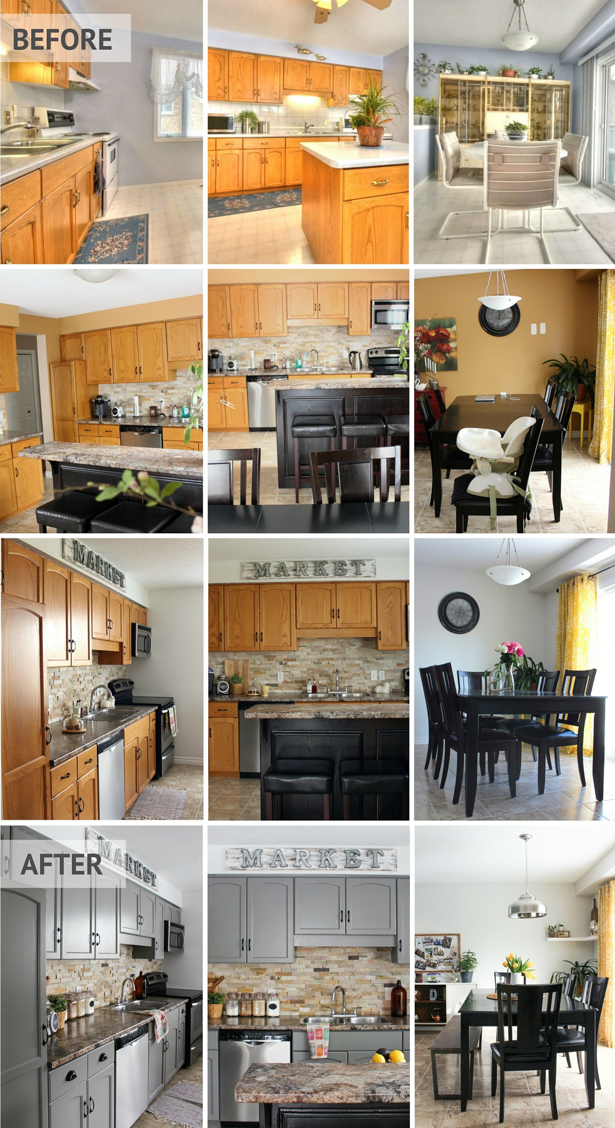
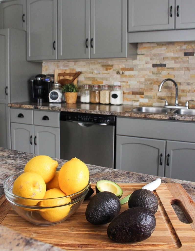
Here it is -- Our Kitchen Cabinet Makeover
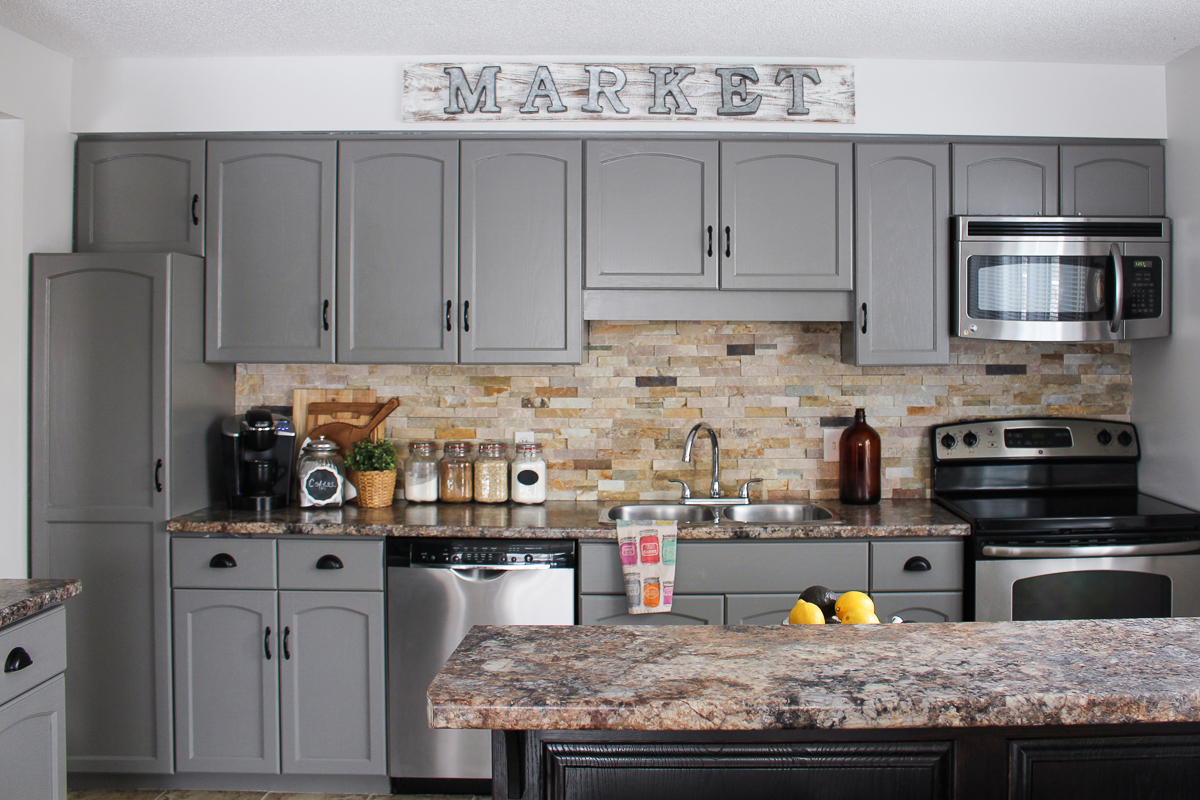
 I decided to change out the drawer pulls (which used to be the same as the cabinet pulls) to some cup pulls. It has really completed the look of our kitchen, feeling more "farmhouse" with an up-scaled appearance!
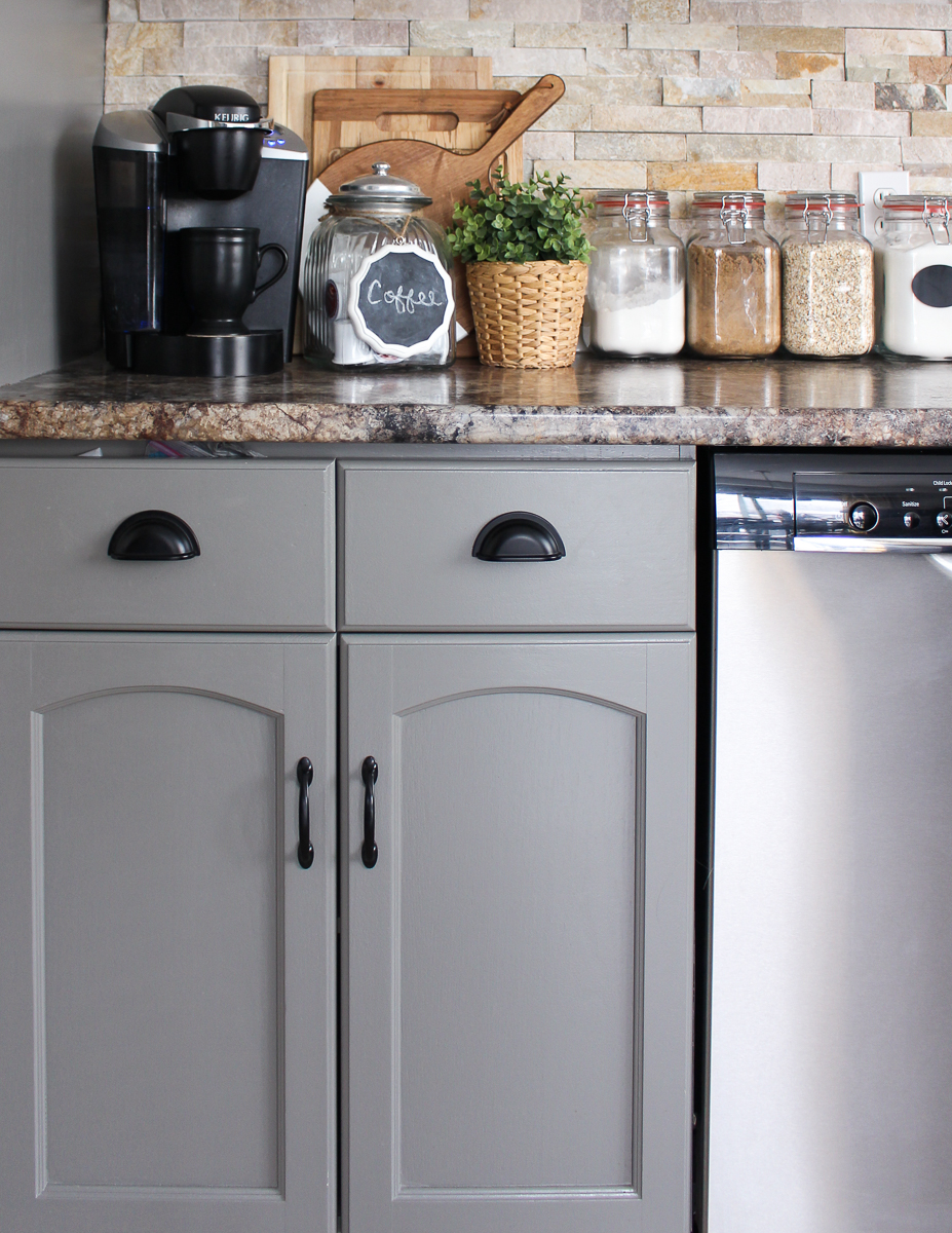
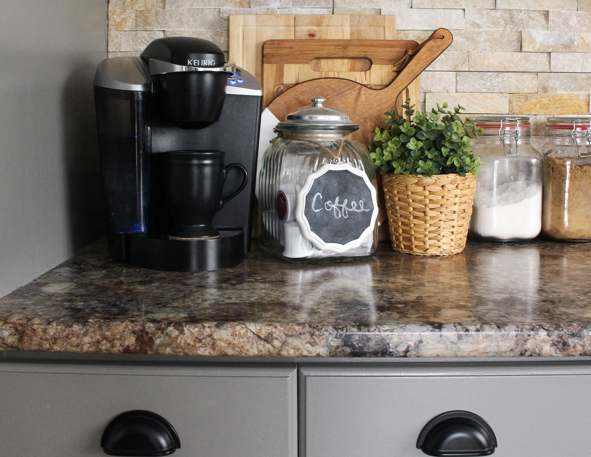
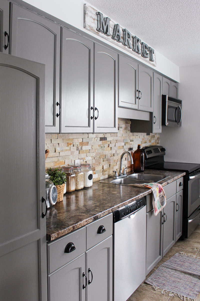 DIY Market Sign tutorial found here.

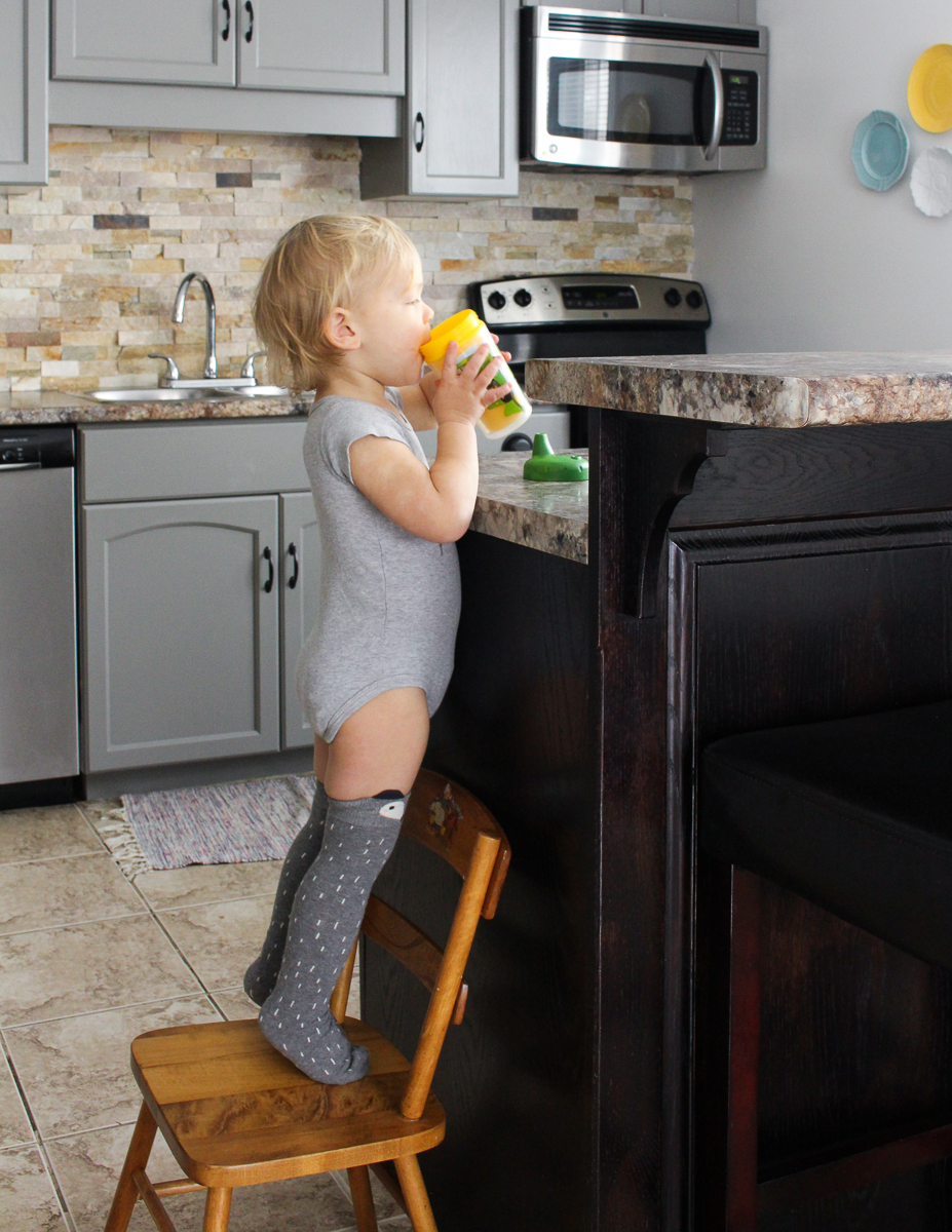
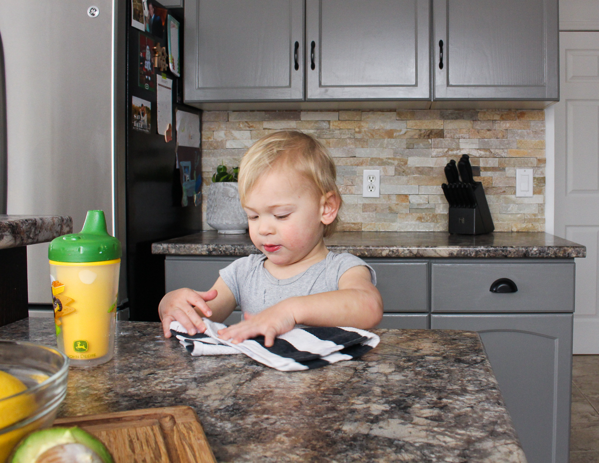 Mama's little
 troublemaker helper!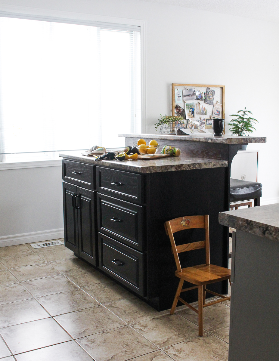
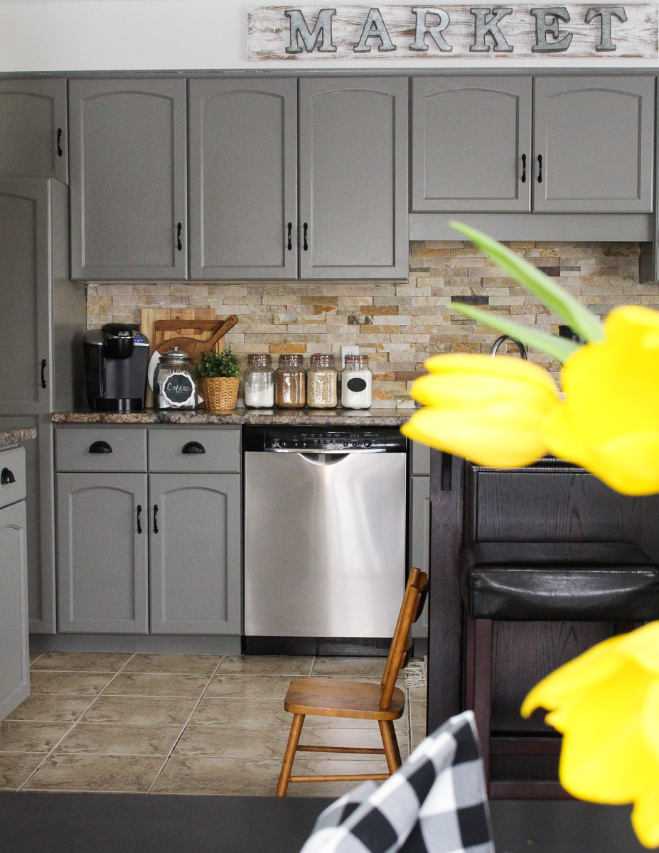


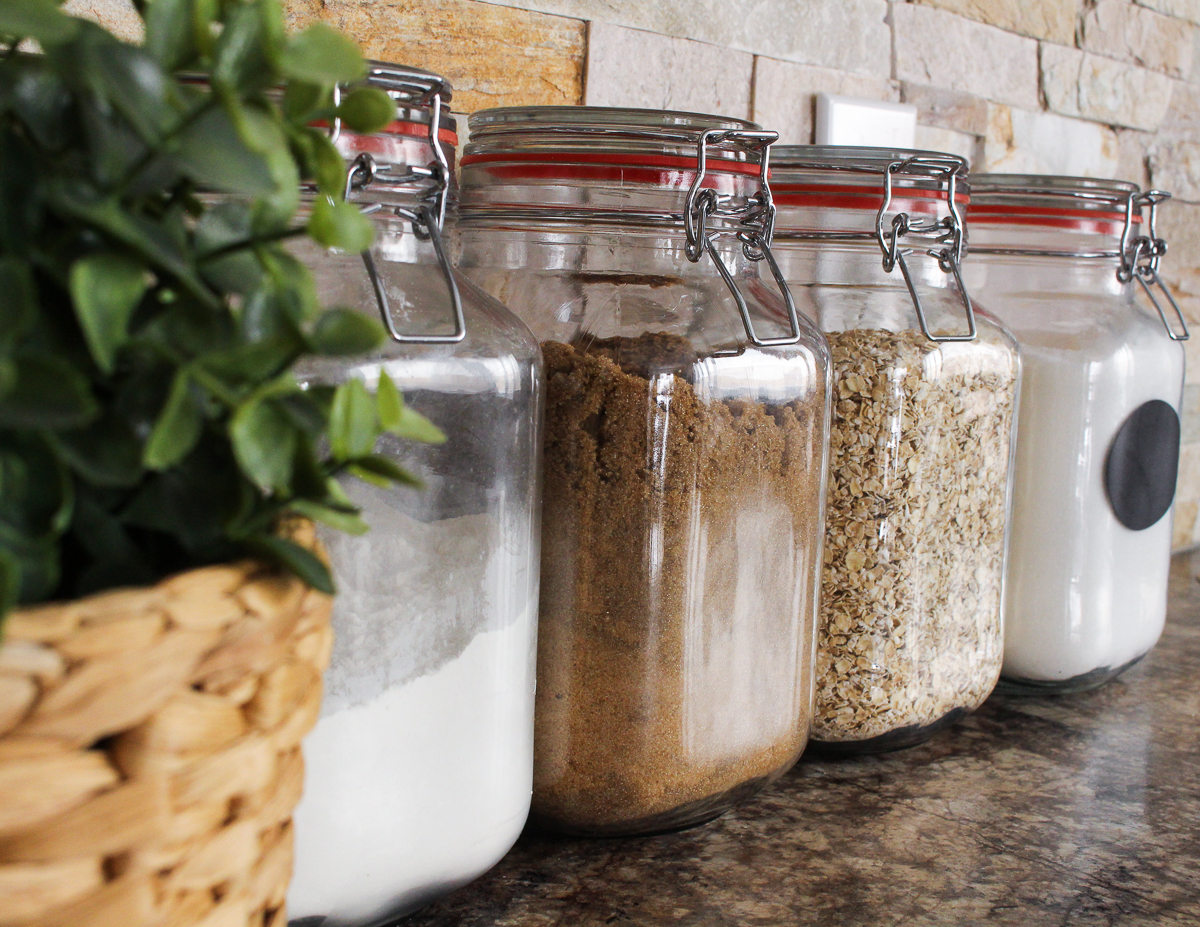
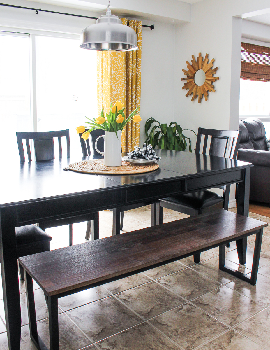
KITCHEN SOURCES:Wall Colour-- Pure White by Benjamin MooreKitchen Cabinet Colour -- Chelsea Gray by Benjamin MooreCabinet Hardware -- Black Cup Pulls, Upper PullsCounters/ Island -- In Your KitchenBacksplash -- The Home DepotAppliances -- TA ApplianceStorage Jars -- The SuperstoreGalvanized Market Sign Letters -- MichaelsDining Table Bench -- Leon'sPaisley Curtains -- TargetStarburst Reclaimed Mirror -- Target
After four days of dirt, sweat and paint, we have grey cabinets! At first, my husband and I would both look at each other and say "what do you think, you like it? Do you really like it??". It was a huge adjustment at first, and I almost thought I missed the honey oak or that I should have went with the darker grey that was the second contender. But now that we have lived with our grey kitchen cabinets for 3 months, I love how our kitchen/main level feel much more modern and updated vs. being consumed with so much wood! If I had to do paint them it all over, I would! This is a cost effective way to update your kitchen and the outcome is SO worth it :)
If you're interested, I will be sharing a break down of the cabinet painting process in the near future!
Thanks for following along,
